How we use Storybook for documentation and code reviews
What are components?
Thinking in terms of components has made frontend development a lot easier to reason about and codebases much more maintainable compared to traditional architectures like MVC etc.
Components are like lego blocks — they’re self-contained UI elements which can be combined with other components to create bigger UI elements. A screen is actually a big component composed of multiple smaller components. It’s components all the way down!
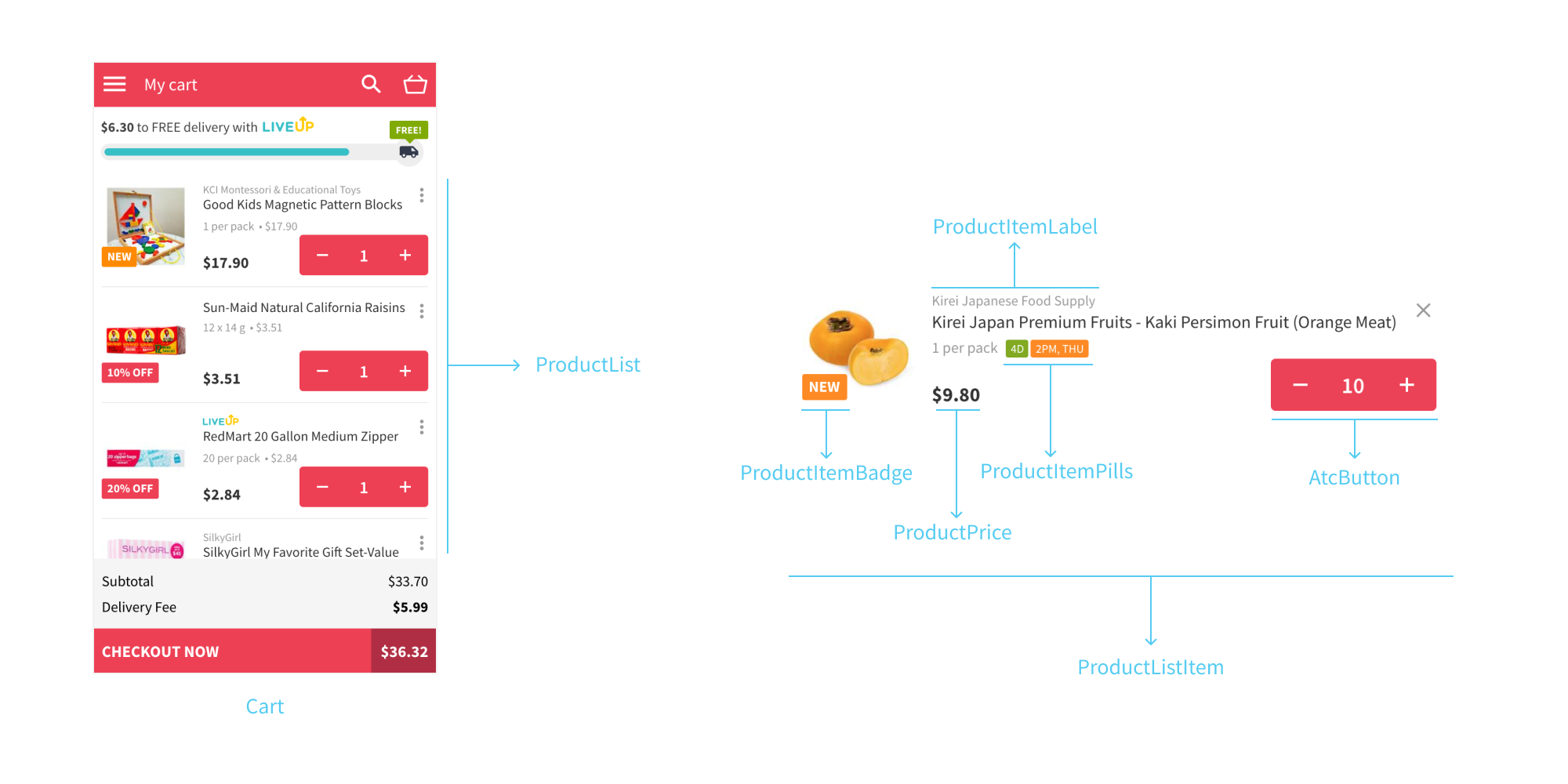
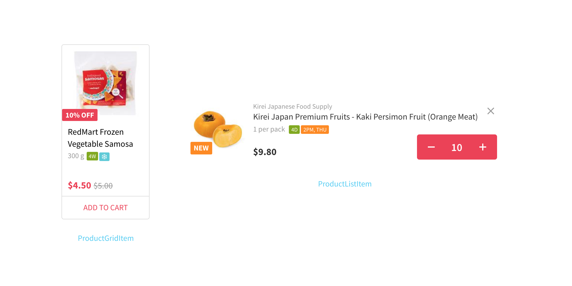
To illustrate the above point, let’s take the ProductListItem component. This component is composed of multiple smaller components like ProductItemPills, ProductItemBadge, ProductItemLabel, ProductPrice, AtcButton etc (Sorry, naming is hard 😉). This component is used by the ProductList component to display a list of products which is again used by screen-level components like Cart, MyList, OrderDetail etc.
The property of components to be self-contained makes decoupling them from the host frontend application trivial. They can be easily extracted to a component library repo and shared with all the different frontend applications inside an organisation or even open sourced to be used by others.
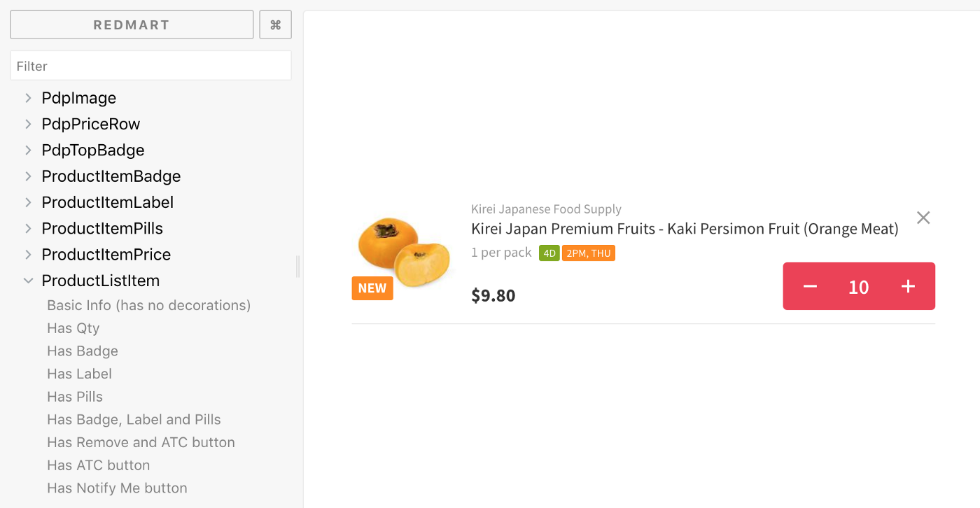
Storybook is a tool for organising such a component library. We also use it for other purposes like documenting component states and communicating changes in PRs.
Documenting states
In UI design, component “states” are the different ways a component visually varies. A classic example is a Button component with states like Default, Hover, Disabled, Loading etc

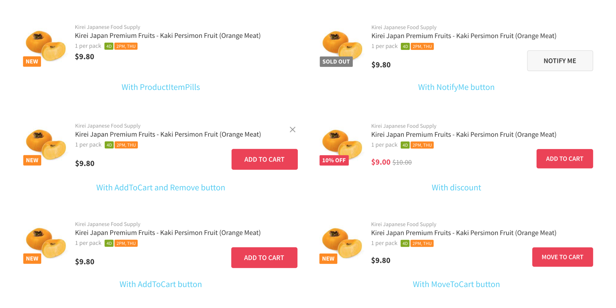
Now, while documenting these Button states are useful, this is not a strong value proposition for introducing a new tool like Storybook to your dev/design workflow. Let’s take a more useful example — ProductListItem and ProductGridItem. These components are very congested visually since they pack a lot of information into a tiny space.
Depending on the product attributes, the above components can have any of the below states and they can also have states depending on the screen they’re used in (You can’t remove a product from your OrderDetail screen etc). Few states of ProductListItem component:
While designing UIs, the less space you have the more challenging it is to add more information or elements to it. The ProductListItem and ProductGridItem components are also frequently changing. Before making a change, you’d want to first see the different states of these components so you can better understand the constraints and edge cases. For this, you can create a static image with different component states in Sketch or Photoshop as documentation, but this not 100% what customers see — There might be some differences between design and actual implementation. Or you can go through the millions of products and different screens in your frontend to see the different states. The ProductListItem is also responsive, so you might need to do this exercise in different form factors!
With Storybook, the above becomes simple. You just create an entry for the component and its different states. It also plugins that let you see the component in different form factors.
This is also useful for components that are visually simple but just have so many states as edge cases.
Communicating changes in PRs
Storybook is a webapp that needs no api backend and can be built into a bunch of html/css/js files that can be statically hosted in S3, Github Pages, Netlify, Firebase etc. Everytime someone merges their changes to master branch, we build Storybook and deploy it. The master branch is what we use for documentation.
We internally use the multi-feature staging environment with great success at RedMart (Thanks Raman!). For example, if you’re working a feature to implement dark mode in the git branch named “feature/darkmode”, when you push this to origin, the CI scripts automatically create a url “darkmode.alpha.redmart.com” for you to share it with your team. This is incredibly useful and it’s hard to image developing without this. The way it works is simple yet genius — every git branch is deployed to a separate directory which gets resolved to by the webserver when accessed via <git-branch-name>.alpha.redmart.com
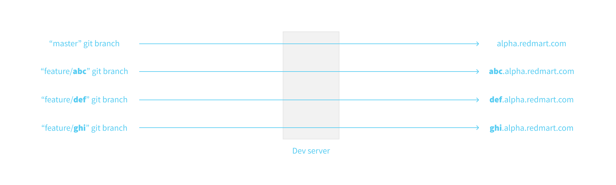
We’ve extended this concept by having a Storybook for every git branch that’s accessible by an unique url. For every PR, the reviewers can go through the Storybook for that feature branch to understand the changes made. This has also made demoing the new/updated component states to the team easier.
This idea can be extended even further by running visual regression tests for the feature branch against master branch’s Storybook to validate the build. Component testing libraries like Enzyme let you assert the DOM changes or event handling based on different inputs passed to a component. But there’s no way (that I know of) to assert the visual changes happening to a component for different inputs. Visual regression testing for Storybooks could help fill that void. Storybook acts as test suites/specs and visual regression tests are the assertions.
Thanks for reading! :)
Originally published in geeks.redmart.com